We’re pleased to announce the third incarnation of the Star Trak site. But first, a few steps back in time…
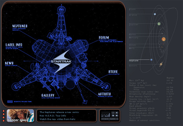
APRIL 22, 2002: STAR TRAK
The beginning. This was a three-person team-up: Heather on management, Nirav on development, me on design. We were all working together on a steadily-sinking ship, and this was our after-hours gig. And, it turns out, this is the project that basically started my career. (BIG thanks go out to Loic here for supporting us from the beginning!)

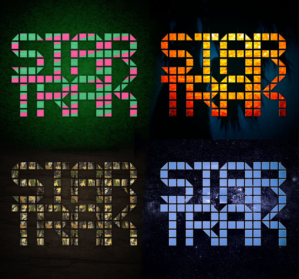
SEPTEMBER 22, 2006: STAR TRAK 2
This is where we took a decidedly, um, unintuitive turn. The plan was to make a fun experience where “content” and “usability” were kind of pushed to the background. And I must say, in that sense it was a huge success! (some people at the label may disagree here.) The site had multiple themes that came up randomly, and a great collection of sound effects by Chad.

and, that brings us to…
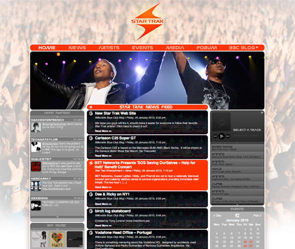
JANUARY 29, 2010: STAR TRAK 3
Today’s version brings back CONTENT in a big way, while keeping some of the multi-theme aspects from version 2. Artist pages all have their own custom look, and the rest of the site has this “red/crowd” theme to start. Expect more themes in the future to promote specific albums/events for the label. (at least that’s what we’re planning!)
Content is overflowing here: direct feeds from partner sites, links to buy music, twitters, a growing collection of videos, (I think it’s about 100 to start?) and yeah, plenty of content. and perhaps a few throwback references to the old days, who knows?
SITE BY FISHBUCKET
Design & animation by Stephen R. King
Additional development & assistance provided by Christopher Najewicz & Will Olbrys
And, thanks to Mike Millions for the label-side assistance and great suggestions. Follow him!
So, now that this site is up, it doesn’t mean it’s time to kick back and relax at Fishbucket. Full lineup of great projects around the corner. ON TO THE NEXT ONE…

